How-To Guides and Tutorials
React Native Renderings: Storybook Sketching

Santosh Baniya
March 29, 2024
This article is about storybook sketching into a React Native application.
What is a storybook?
Storybookis a tool for building UI components that makes development easier and more faster by isolating components.
What frameworks does the UI tool support?
The open source tool streamlines UI development, testing, and documentation, and is made for React Native, React, Vue, Angular, Web Components, Ember, HTML, Mithril, Marko, Svelte, Riot, Preact, and Rax.
Why do developers adore Storybook for UI component management?
Developers love Storybook for its ability to make UI component management as simple as Lego blocks. It provides clarity in the middle of complicated code bases by isolating components for testing and study without interruption.
Why Storybook for sharing work?
No need to worry about data dependencies or business logic. This makes it much easier to share your work with other developers or clients who can validate that things actually work the way they're supposed to.
Storybook Setup
Let's create a new expo app using the typescript template. You can also do this in your existing app.
yarn create expo-app -t expo-template-blank-typescript cd my-app
npx sb@latest init --type react_native
This will create all the files and install all the packages you need to get started.
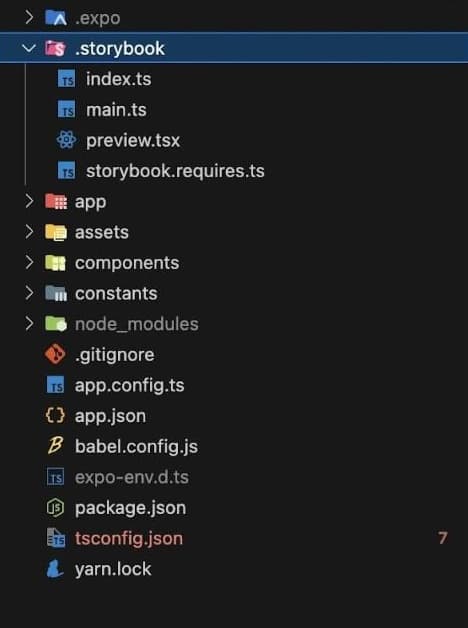
So inside the project, we have a storybook folder that got added by that command. The index file, which has some setup, we have a generated file here that you'll use to basically generate all the components.
Lets now take a look at what got added to the project.
Two new scripts, a few new packages, and a .storybook folder containing all of the storybook configuration were installed. The Storybook component, which must be rendered in order for Storybook to function, is exported by the .storybook/index.js file.
Now in your editor open up App.tsx (or js/jsx) and import and export the component .storybook/index.js like you would normally export the App component.
import StorybookUI from "./.storybook";

export default StorybookUI;
For now comment out your existing default export but later you can setup a way to swap between storybook and your app.
Next, if you're on expo you'll need to generate metro config file with npx expo customize metro.config.js
Then in that file add sb modern to the start of the resolver.resolverMainFields array. In expos generated file you can do it like this.
// Learn more https://docs.expo.io/guides/customizing-metro
const { getDefaultConfig } = require("expo/metro-config");

/** @type {import('expo/metro-config').MetroConfig} */ const config = getDefaultConfig(dirname);

config.resolver.resolverMainFields.unshift("sbmodern");

module.exports = config;
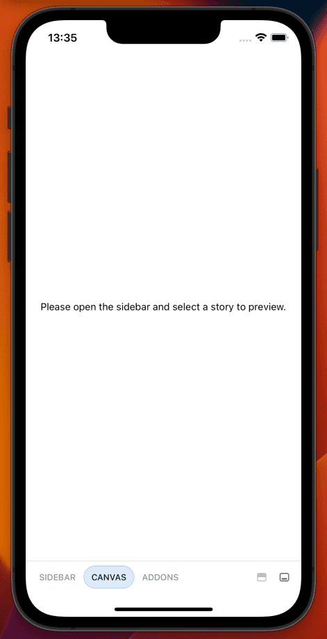
Now you can run yarn ios or yarn android and when the app opens up you should see the storybook UI.
Creating a story of a component
├── components
├── Button
├── Button.tsx
├── Button.stories.tsx
// Button.tsx

import React from 'react';
import { StyleSheet, Text, View, TouchableOpacity } from 'react-native';

const Button = ({
  label,
  onPress,
  style,
  textColor = '#ffffff',
  backgroundColor = '#95C4CB',
  fill = false,
  ...rest
}) => (

    {label}


);

export default Button;

const styles = StyleSheet.create({
  wrapper: {
    height: 45,
    alignItems: 'center',
    justifyContent: 'center',
    borderRadius: 30
  },
  label: {
    fontSize: 14,
    fontWeight: '500',
  },
});
// Button.stories.tsx

import * as React from 'react';
import {View, StyleSheet} from 'react-native';
import {storiesOf} from '@storybook/react-native';
import {action} from '@storybook/addon-actions';
import {object, text, color, boolean} from '@storybook/addon-knobs';
import Button from './Button';

storiesOf('Button', module)
  .addDecorator(story => {story()})
  // you can add multiple variants of component, here's variant with name 'default'
  .add('default', () => (

  ));
s;

const styles = StyleSheet.create({
  decorator: {
    flex: 1,
    justifyContent: 'center',
    padding: 16,
  },
});
Why aren't new stories showing up?
After adding new stories you might notice that they don't immediately show up, thats because currently you need to run yarn storybook-generate each time you add a new story.
You can add it to the start command like this so that you never forget
"start": "yarn storybook-generate && expo start"
javascript
React
reactjs
typescript
web-development